


Market & Competitor Research
Full Case Study Available In Desktop
User Research
Information Architecture
User Flow
Design Issues & Solutions
Base On Psychological Theories
We conducted an in-depth analysis of three main competing systems:
Shift Organizer, Connecteam, and Synerion.


Key Findings
Key Findings
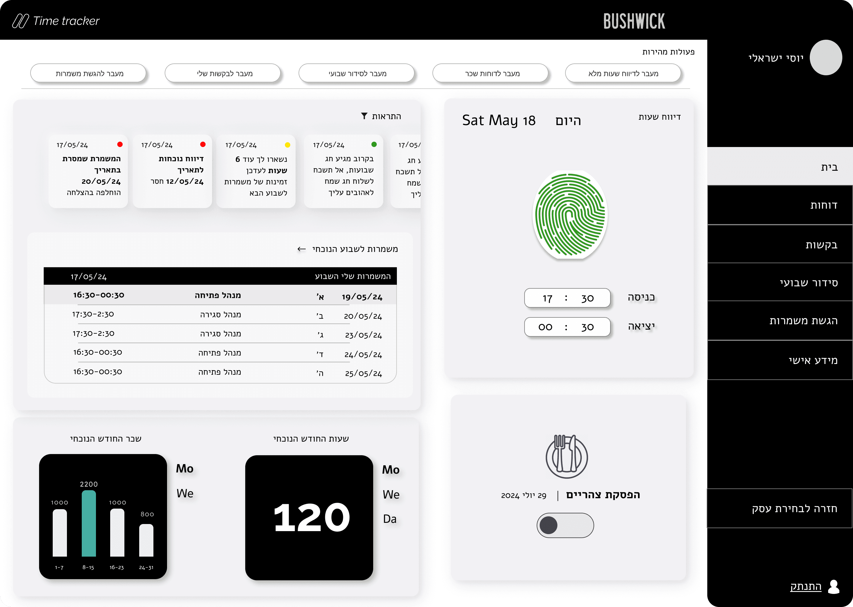
Attendance and Work Hours Tracking
User-Friendly Interface
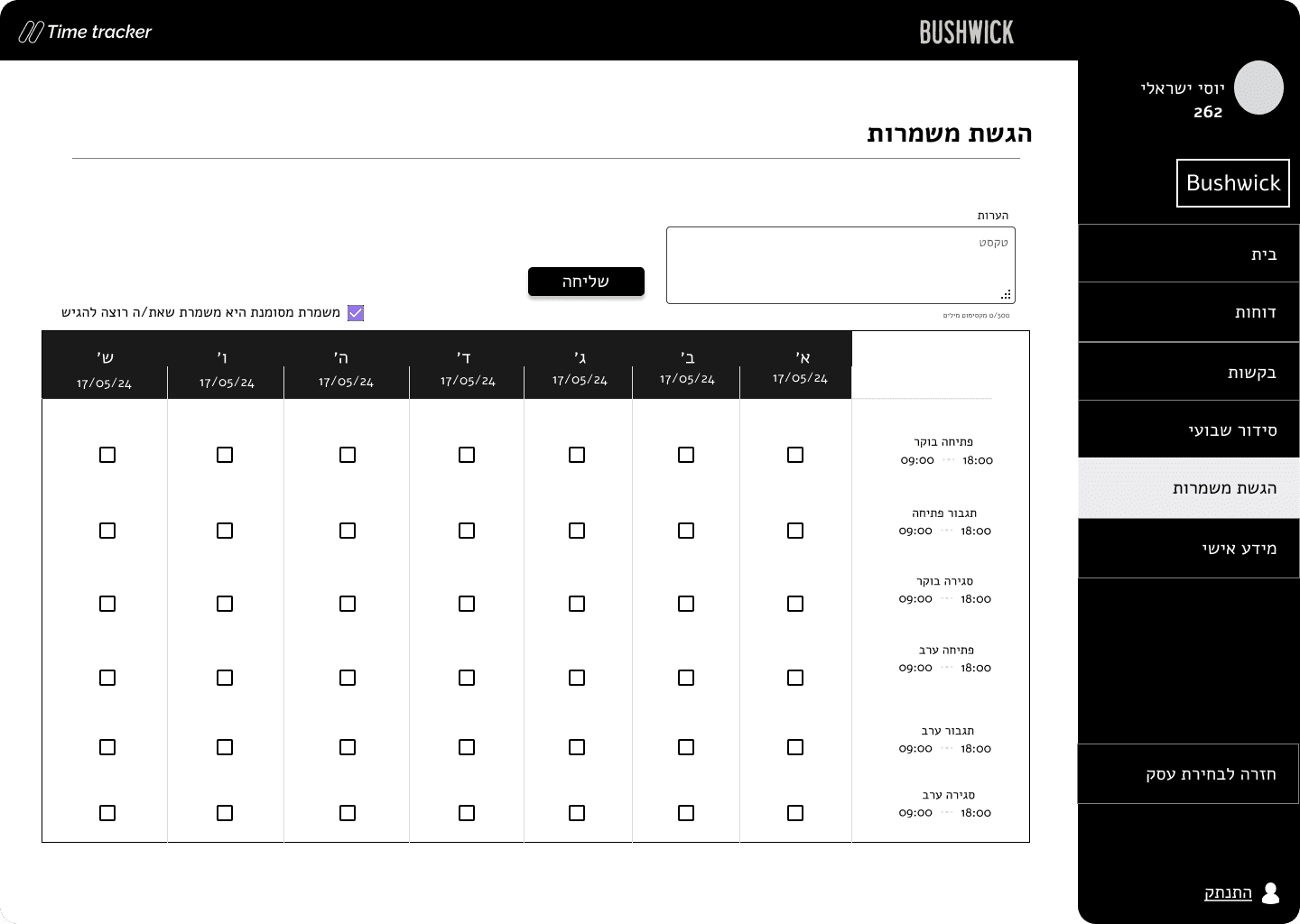
Leave and Special Event Management
Our research included surveys and interviews with users who frequently work with shift management systems.
Survey
What is the main purpose of your system usage?
50
40
30
20
15
10
0
View Schedule
Submit Shifts
Communicate with Managers
View Reports
What issues do you encounter when using the system?
45.5
38
30
23
15
8
0
Paycheck Management
Manage Work Hours
Communication Issues
How often do you use the system?
Daily Basis
Multi-Weekly Basis
Interview
We conducted 5 semi-structured, face-to-face interviews


Issue
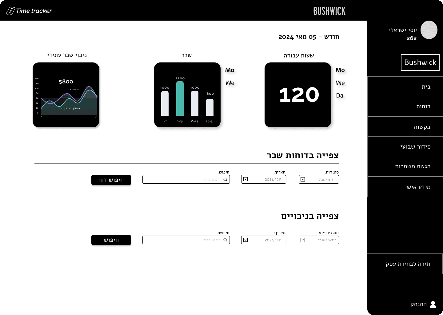
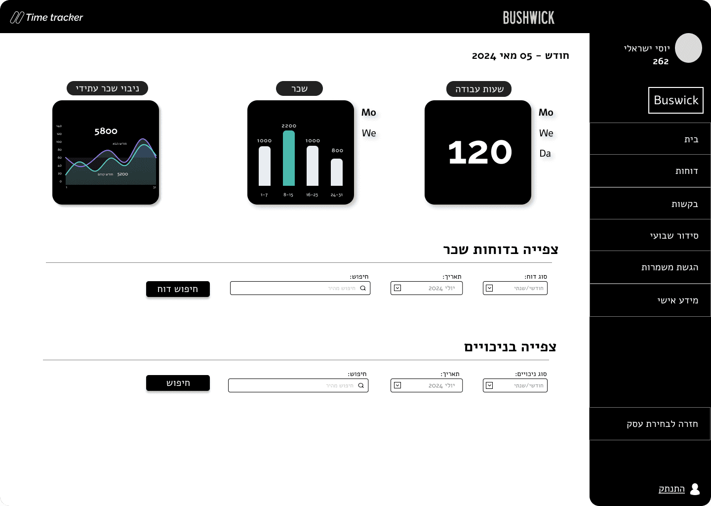
Users faced difficulties in tracking, processing and manipulating work hours and salary reports, especially when they needed to perform complex calculations.
Solutions
We applied the availability heuristic by Tversky and Kahneman, creating visualizations of reports using intuitive graphs and prominent colors. This reduced cognitive load and helped users easily track their data.
We used working memory principles such as chunking information into smaller, manageable units and combining visual (spatial-visual sketchpad) and verbal (phonological loop) information, which helpes users better understand and retain the information, reducing cognitive load and facilitating quicker, data-driven decision-making.
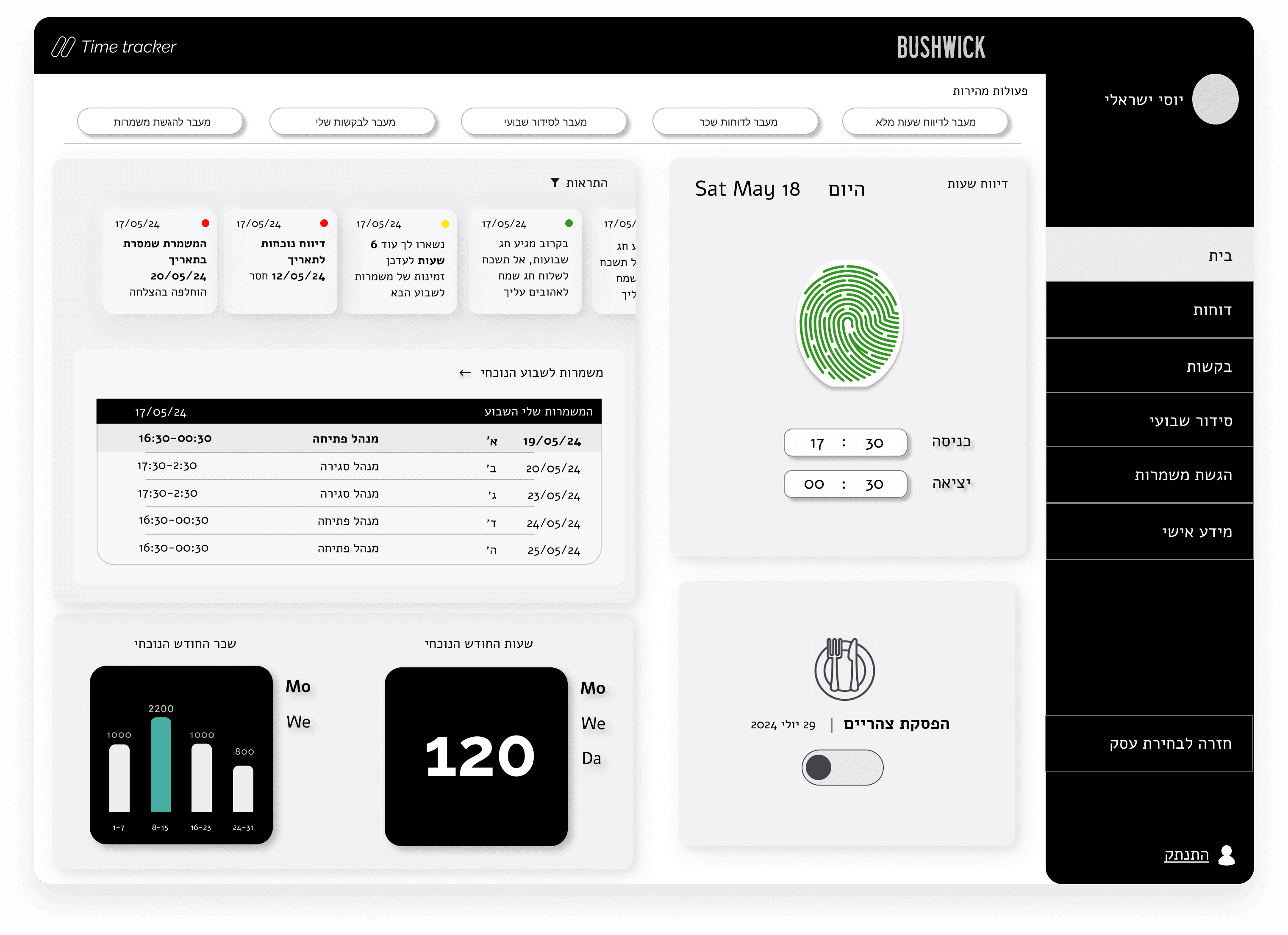
Issue
lack of responsiveness when users logged work hours. Users wanted immediate feedback to confirm that their action was successful, reducing anxiety and uncertainty. This immediate feedback was important for enhancing transparency, efficiency, and trust in the system.
Solutions
We addressed this issue by implementing real-time feedback based on Treisman's Attentional Filter Theory, which suggests that only relevant information passes through to conscious awareness. In our system, color-coded notifications were used to capture attention:
if there was an issue, the system displayed a red notification, and if the action was successful, it displayed a green notification.
Following Kahneman's System 1 and System 2 model, we aimed to reduce the cognitive load associated with System 2 (effortful thinking) by relying on System 1's automatic responses.
The use of color as a quick visual cue leverages System 1's fast, intuitive processing.
For example, a red color on the dashboard signals an important issue, automatically capturing attention and prompting action without extensive deliberation. After completing the action, the green color signals completion, which reduces cognitive strain and reassures the user that the task was successful. This immediate feedback minimizes uncertainty and enhances user confidence.


Complex
System
Design
The Design Process
This project was a part of a course in which i was task to design a B2B system.
The goal was to design a system that improves the user experience in shift management while providing convenient tools for reporting work hours, submitting leave requests, and calculating wages.
Overview
Role: Product Designer, UX Research
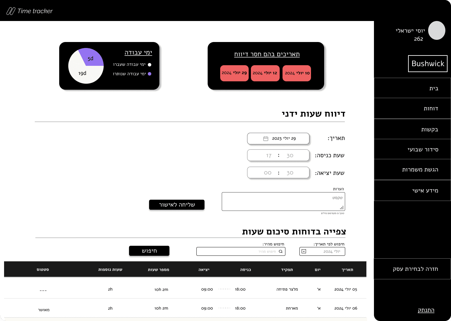
The system should offer easy clock-in and clock-out options, with detailed reports that are accessible and easy to understand.
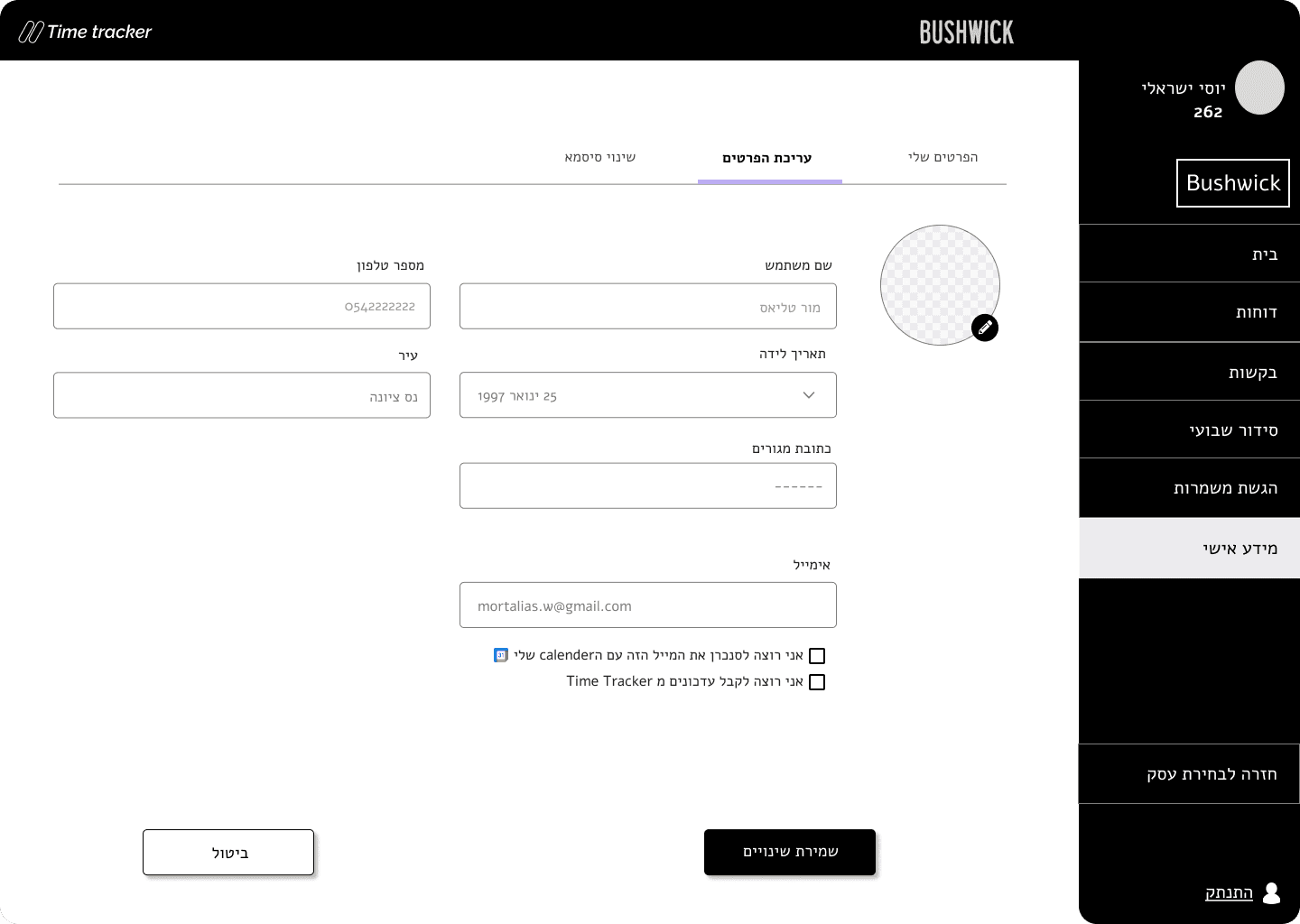
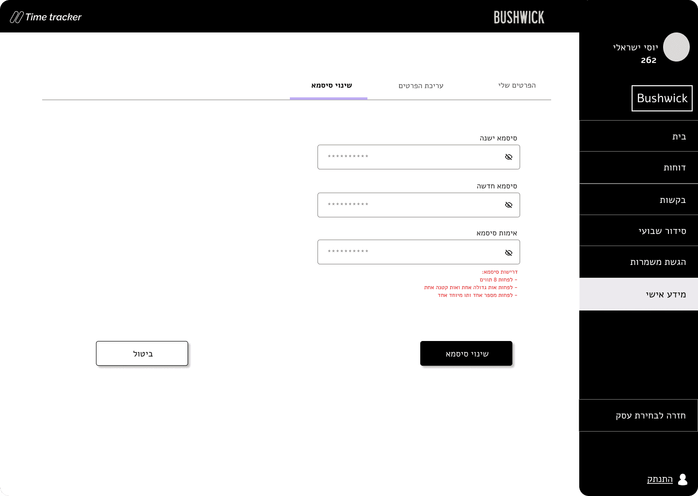
Users highlighted the need for a simple, intuitive interface that reduces cognitive load and allows for seamless operation without errors.
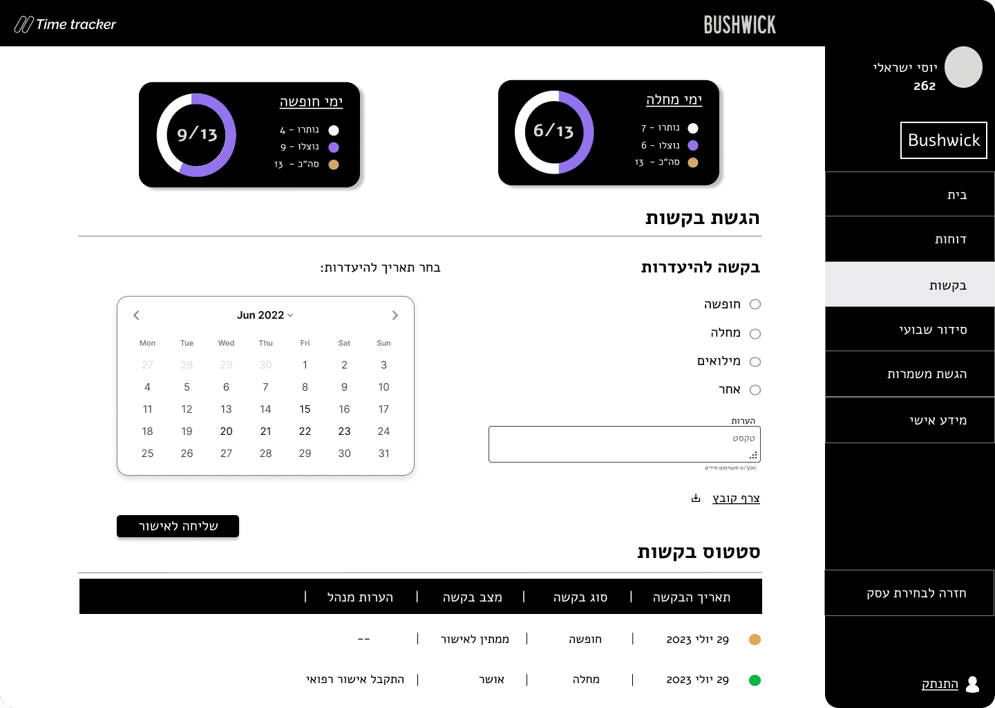
Managing leave and absences easily was critical.
The system needs to offer tools for approving leave requests, either automatically or manually.
You Can Contact Me Via